Jay Peter Salvas is a New York City–based creative director, graphic designer, and visual artist.
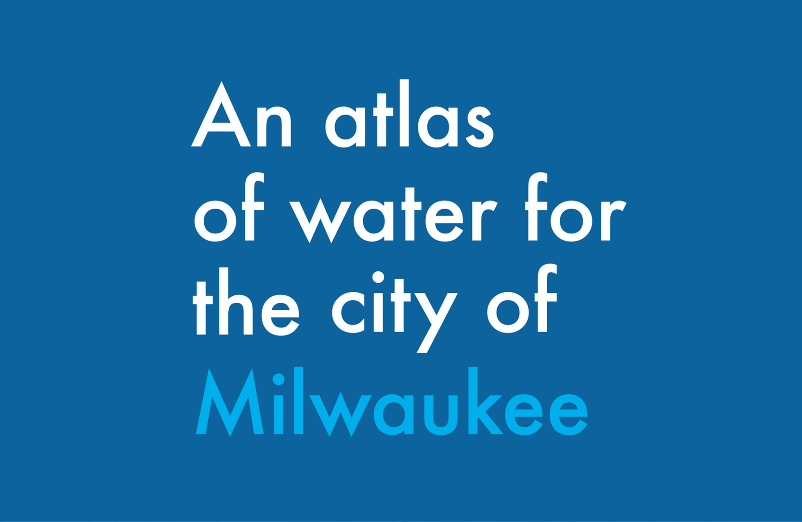
WaterMarks Branding a New Water Narrative for Milwaukee
WaterMarks aims to create a new water narrative for the City of Milwaukee, where citizens recognize water as a resource and a responsibility.
Concept
The minimalist design system employs generous white space and precise geometric typography, underscoring clarity as both a visual principle and an environmental imperative.
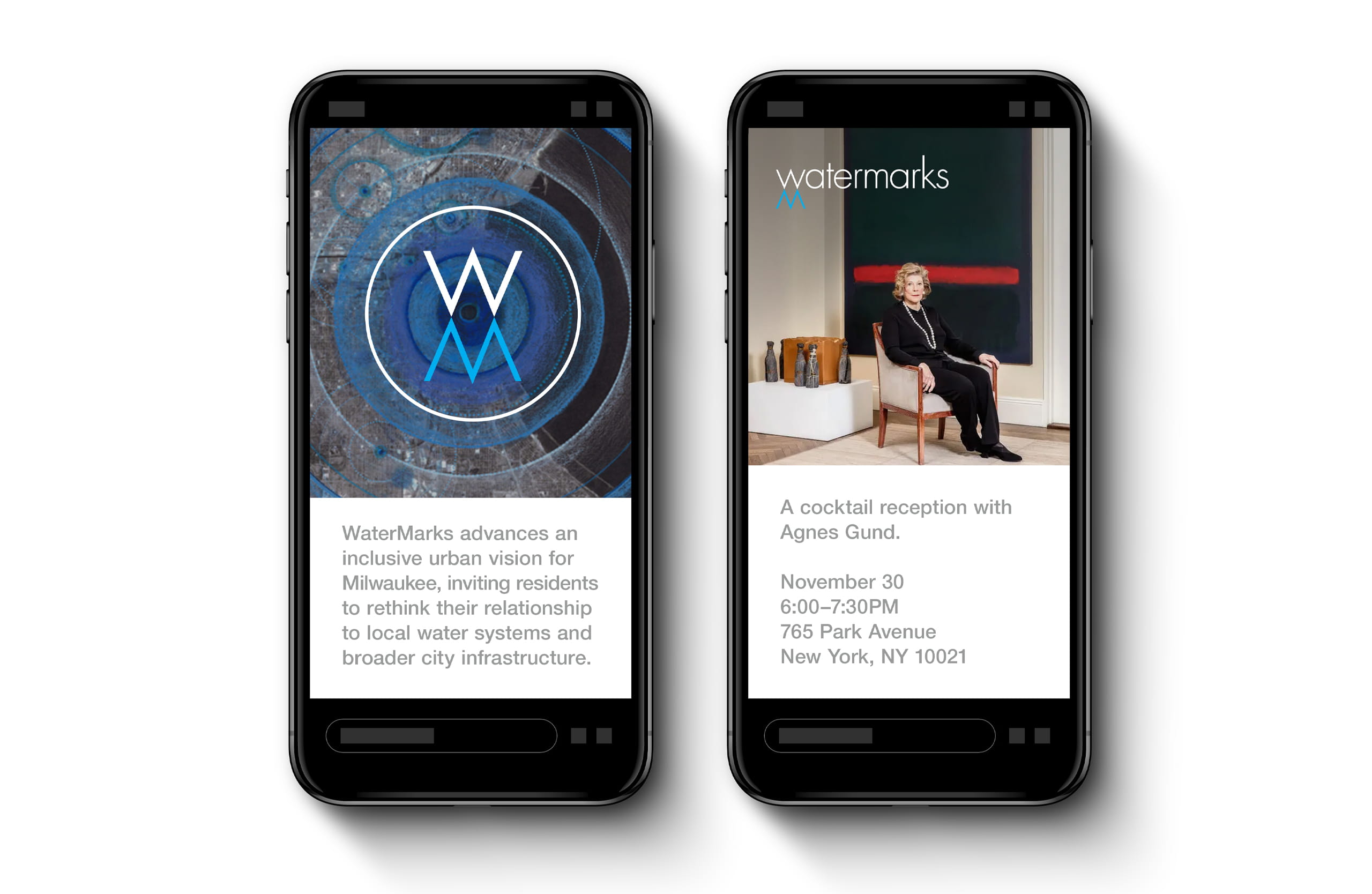
Logos
With its geometric precision and clean anatomy, the typeface allows the logotype to subvert the “W” in WaterMarks, transforming it into a mirrored “M”—a reflection of itself, much like the reflection seen when looking into water.

The logomark, borrowing the ‘W’ and ‘M’ from the logotype, is contained in a circular form, nodding to the ripple effect when the surface of water is activated by an object.
A call-to-action wordmark was designed for consistent application across a variety of assets.
Color System
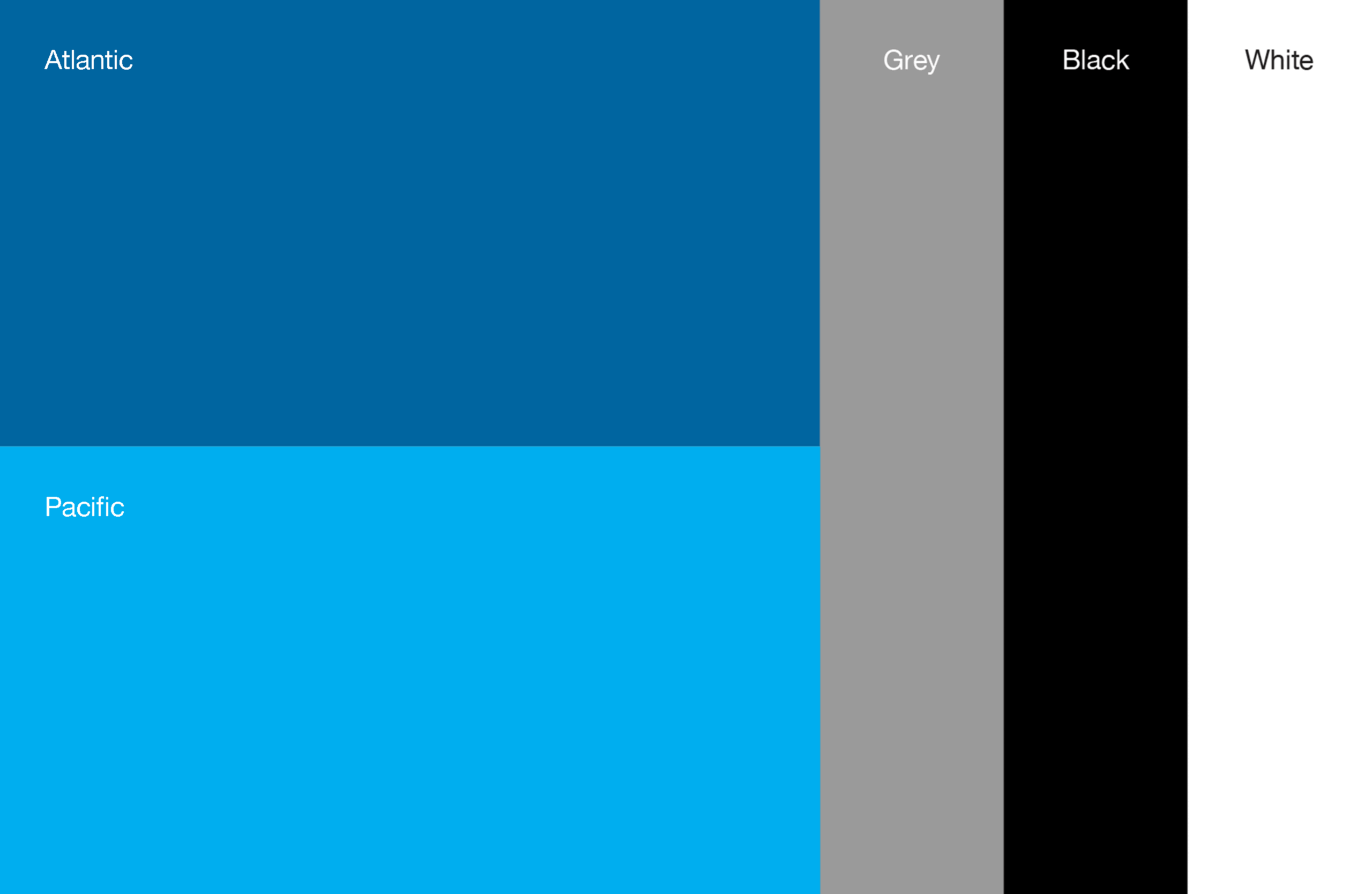
A color system was designed to celebrate the vibrant culture of Milwaukee and nod to the Pacific and Atlantic oceans.
Graphic Pattern

The graphic pattern, comprised of the ‘W’ and ‘M’ in the logomark, evokes the repetition of light reflecting on moving water.
WaterMarks: Walks
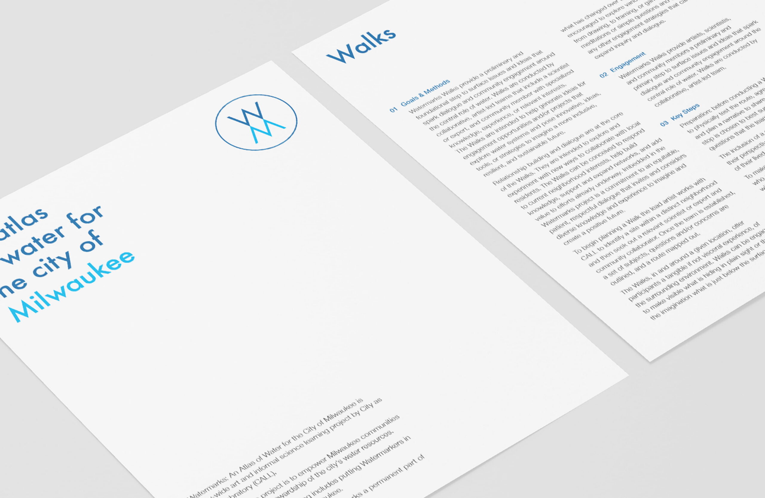
WaterMarks “Walks” are guided, participatory neighborhood tours led by local artists, scientists, and community members that explore how natural water systems have been shaped by urban infrastructure and human activity.
A one-sheet template for the guided “Walks” was designed, along with social media assets, to drive interest in the initiative.
Suggested
Next Project >